PowerPoint, how I hate thee!
Look familiar? The bane of students everywhere. But we have to use it don't we, I mean what would university/college life be without the lovely experience of tinkering with the computer for like 10 minutes while your lecturer and all your other classmates bore holes into your back as sweat pours down your face while you curse and mutter under your breath why the stupid projector and computer won't talk to each other and display a @#%*&$ picture! We at Tales of a disgruntled PC user understand your pain.
One of the main gripes that I've encountered while using this stupid piece of software has got to do with something called "Presenter's View". If you've never heard of it before, its ok but I think most people out there who are even mildly familiar with computers knows what I'm talking about. So what is so bad about presenter's view? Well, on a Mac its actually not that bad. Which goes to show that microsoft doesn't just make crappy software, rather they make crappy software just for their own windows users. Ironic, I know. Ok, so now on to the main article!
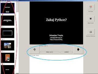
Right, so here's the offender. Notice the red colour oval? Your presentation is presented as a vertical column with the slide that is currently being shown in the centre. Easy right? Looks straightforward? Wait till you actually TRY to navigate, the main verb here is TRY. The most natural thing one would think of would be to use the up and down arrow keys to navigate through right? WRONG! In PowerPoint, pressing the up key is the same as pressing the down key. It ALWAYS goes to the next slide. Neat isn't it! Bet you didn't know that though and I'm sure you have had the experience of trying to go back to the previous slide by pressing the up key repeatedly only to jump to the next slide, and then the next, and the next, looking oh so foolish at the same time. So, how do you navigate properly then? Well, see the blue colour oval? THAT is how you do it. You're supposed to press left and right to navigate through your slides. I'm sure those geniuses at microsoft did their GUI studies and were assured that people wanted to be purposely misled by giving them an upright/vertical column to see their slides while expecting them to actually press left and right to actually navigate through.
So, we've seen the main offender. Has anything changed since Vista? Well yes and no. Let me just illustrate the point.
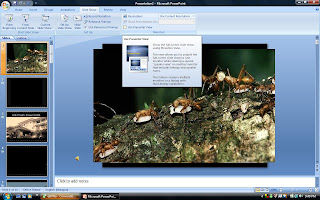
So as you can see, in Vista everything looks so glassy and futuristic. This is PowerPoint 2007 by the way. Just so you don't get confused.

This is another one of my gripes with PowerPoint which hasn't been resolved. Unless you have a dual monitor setup, or you have your LCD projector hooked up, windows will not allow you to launch Presenter's view. They even give you a nice dialog box telling you so. How thoughtful.
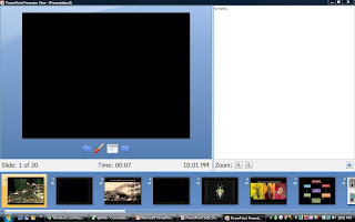
Ahhh, there it is ladies and gentlemen. Microsoft did something right for a change. This time, slides are presented to you in a horizontal position so that the most natural thing is to go left and right. Oh, and they fixed the up down bug thingy too, how nice of them. Pressing the up key brings you to the previous slide, while pressing down advances you to the next slide.
I've never had those kinds of problems on a mac. Want to know why? Well two reasons. Number one is that the Mac Business Unit of microsoft must be where all the bright people are. Seriously, Office for Mac is so much better than Office for windows. I don't know why this is so, but I am so glad I'm using a Mac. Not to say that MS stuff is better than Apple's stuff but its just better than their windows product. Go figure.
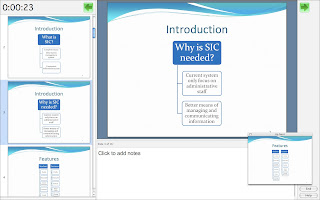
Ok, so it does look like the windows version of presenter's tools BUT the key difference is that pressing the up key, actually does go to the previous slide! So, while I might be wondering why the hell Microsoft software looks so clunky and ugly it still works in this case. Oh and you don't actually have to be connected to a projector to make use of presenter view. Really nice!
The number two reason of why I don't have those kinds of problems, and this is the REAL reason is something called Keynote. Its an excellent piece of software developed by Apple software engineers which is so much simpler to use than power point. It may not be as powerful as power point, but it works so much better (as does all Apple technology) and doesn't give me as many headaches as windows/office does. So what does it look like? Well its gorgeous!
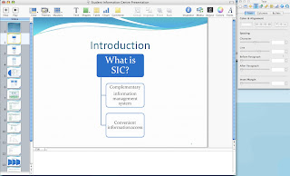
Its simple, easy to understand and most importantly reliable! What more could you ask for :D
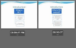
And this is what happens when you actually start playing the keynote presentation. Its so easy, so intuitive. There's no way you will get lost trying to navigate through your slides. It just shows current slide, and next slide. I like simplicity. Its good.
So thats it for this week folks. We at Tales of a disgruntled PC user have a solution for all your PC related problems. Get a mac. Seriously!
1 pseudo-code(s):
Yes, your post on Powerpoint is so true. I think you know how badly the PP screwed up my Keynote subtitles for the drama.
And after using Keynote, frankly, I would not wanna use PP ever again, no thanks, unless there's no alternative. Anyways, Vista might look nice and all, nice graphics and things like that, but once Leopard comes out, it's gonna fall back say... 5 years back? Haha...
MAC ROCKS!!!
Post a Comment